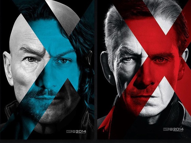
The teaser posters for next year's 'X-Men: Days of Future Past' are interesting in their attempt to combine the faces of both actors for each of the characters of Professor X and Magneto. The general concept behind the new film is that it features the casts of both the original X-Men trilogy and the semi-prequel/reboot 'X-Men: First Class', and I believe that this series of posters demonstrates this well enough. The design of these posters has background of the image featuring the actor who plays the older version of the character (Patrick Stewart in the case of Prof. X and Ian McKellen with Magneto) in black and white with part of their faces obscured by the shape of an x that contains the face of the actor of the character's younger counterpart (James McAvoy and Michael Fassbender, respectively). Applause must given to the designers of this poster who have clearly achieved a lot by combining the faces of actors who in real life only bear slight resemblance, yet in this poster all of their facial features match up - for instance their jaws, their lips and their hairlines (well not in the case of Patrick Stewart). Both characters are in close-up with their eyes aimed directly at the audience, with a slight feeling in this poster that they are 'recruiting' you to their cause by the way they are looking.
Each character is given a distinct colour scheme - Prof. X has a blue x, while Magneto's x is red - with the obvious difference being that each character represents a different side of the good and evil scale, even though the synopsis of this film suggests that a new threat unites both characters together, which is not something that the posters are suggesting with their use of colour. Other than the closeup images of the lead characters there is little to be found in the rest of this poster other than the year of release which is 2014 and the movie studio logos, in this case Marvel and 20th Century Fox. No cast or crew credits appear and, unless my eyes deceive me, there appears to be a Twitter hashtag containing the film's title. Similarly to previous posters I have analysed, the studio is aware of the growing popularity of social networking and so are capitalizing it by encouraging (albeit with a tiny font at the bottom) by suggesting audiences should tweet about the film. Director Bryan Singer is a known user of Twitter and in fact has been sharing with millions of Twitter followers the development of the film, from casting to production photos, who presumably will then share these to their own followers.
While at first glance, and even more so after analysing it for the blog page, the cover for 'The Amazing Spider-Man 2' edition of EMPIRE Magazine is somewhat hideous but it also full of things to talk about regarding layout, text and design. With a large image of Spider-Man slap bang in the centre of the poster with his iconic fingers raised in web-shooter fashion, EMPIRE are both attracting and deterring potential readers. A highly recognisable figure, people of all ages may be drawn to the vibrant colours of his costume. but his theatricality, and the manner in which it is displayed in this cover, may put off some people. In accordance with the Spider-Man theme, modification has be done to the title of the magazine in order for it to relate to the film's plot. The antagonistic character of Electro (who is not featured on the cover) has the power of controlling electricity and so it only seemed fitting for EMPIRE to change their logo to reflect this power and so it is styled as to look it has been created out of electricity. In my mind, however, it is a very cheesy effect and perhaps has not been designed as well as it could have been. This is also my opinion of the colour scheme of the poster. While the red and blue of Spidey's costume, and the various shades of blue found in the background and electric logo, are acceptable and to an extent effective, the use of bright green is unappealing to the eyes, and more than anything reminds me of the nineties show 'Goosebumps' and is too odd looking in relation to the rest of the cover.
The cover features a great deal more text than is usual for an EMPIRE Magazine cover, making it look rather cluttered and messy, further exacerbating the ugly state of affairs, but this is a success for the publisher as it means they can showcase a lot of information about what exactly is contained within the pages and so draw a much wider audience who individually would be interested in different films (and television shows as the cover points out). Five film titles appear in large, bold letters on either side of Spider-Man while two separate boxes beneath single out the sci-fi films 'Gravity' and 'All You Need Is Kill' with an image each and a short line that mentions their star and a use of alliteration to explain their role in the film, for instance 'Bullock does Speed in Space' which references lead actress Sandra Bullock's previous acting role and a (very weak, I must add) comparison between the film's two plots. 'Gravity' is very much unlike 'Speed', despite what EMPIRE suggest. Underneath the EMPIRE logo is another short line, promising '15 Electric Comic Con Exclusives' using the word 'electric' as an obvious allusion to the world of the film, while the top banner is unassociated with Spider-Man and instead focuses on the twentieth anniversary of the release of 'Jurassic Park', as well as its impending 3D theatrical re-release with 'Access All Dinosaurs' a play on the phrase 'access all areas' implying that the reader will discover some secret, unknown information about the film and its creation, while bold, yet painfully typical, words and phrases like 'First Look!', 'On Set!' and 'Inside!' are used at the bottom left of the cover to provide further insight into the magazine's contents. Overall, the EMPIRE Magazine cover is functionally acceptable but aesthetically speaking, it dissapoints and all fronts and so design is something I am going to take considerable care with developing my magazine cover.
Coming off the heels of 'Django Unchained', director Steve McQueen's 'Twelve Years A Slave' looks to continue the trend of controversial yet critically acclaimed films that depict the harsh treatment of blacks during the time of the slave trade in pre-Civil War America. With a much more understated approach than the over the top, darkly comical one used by Quentin Tarantino, the trailer for this film establishes it as harrowing depiction of the atrocities of the time and specifically those inflicted upon the central character of Solomon Northup, who in the trailer, as a free man of social standing, is tricked then beaten, imprisoned and sold into slavery. With the use of Hans Zimmer's 'Time' theme from the film 'Inception', the opening of the trailer is almost peaceful (with the visuals of the house and surrounding fields highly reminiscent of the estate of the character Big Daddy in 'Django'). This brief scene showcases an exchange between Ejiofor's Solomon and the character played by Brad Pitt in which the latter expresses surprise at the supposed life-long slave's previous exploits. It is at this time that that the trailer flashes back to establish, with the aid of Solomon's narration, explain the series of events that led him to his terrible and tragic predicament that sees him torn away from his family and way of life, the key dialogue being "I was born a free man...till the day I was deceived" and given to a series of owners that vary in their treatment of him. A brief part of this sequence is scored with the same music that was used to great effect in the 'Tinker Tailor Soldier Spy' trailer and here it has the same dark and ominous impact.
The mid section of the trailer begins with the voice of a black woman singing a folk song as various shots introduce what is presumably the setting for most of the film - the estate of the film's antagonist who's strict religion and violent tendencies are witnessed through various exchanges he has with other characters including Solomon. Our lead character explains his attempt to repair the disruption to the equilibrium of his life with the line "...but I don't want to survive, I want to live." This is a very dramatic piece of dialogue that shows the character's defiance against his master, in direct comparison with his fellow slaves who advice him to stay quiet and avoid trouble. Audiences love to see someone rebelling against the system, especially in order to reach the ones they love, and the remainder of the trailer also helps to cater to this desire, with Solomon's words of defiance reaching full effect. Another piece from Hans Zimmer's expansive repertoire, 'Journey to the Line'from the film'The Thin Red Line' (which McQueen previously used in the trailer for his earlier film 'Shame'and clearly is a fan of) is used to score the end montage in which the film's long list of highly acclaimed actors, in addition to a number of newcomers, appear as title cards and brief shots to identify them.
The most well edited part of the trailer is when Ejiofor delivers part of a rousing, epic speech (which leads me to believe that he would make a fantastic Martin Luther King Jr. in a future biopic) and the music swells in accordance with the drama. It is interesting how actor Benedict Cumberbatch receives third billing, despite only appearing in a single one second shot in the entire trailer, suggesting that in the overall scheme of things his role is minor and his name is promoted more due to the fact of his recent A-list status, with roles in blockbusters such as 'Star Trek Into Darkness'. In addition, despite the accolades awarded to some of these actors there is no mention of them, or to think about it, the director's previous work (which has been universally acclaimed) so we can see the filmmakers have no need to rely on them to draw audiences but rather the strength of the storyline and the performances featured in the trailer. In conclusion, this trailer is a very strong use of footage and dialogue in order to successfully promote a film of such an important story. 'Twelve Years' is the definition of Oscar Bait if there ever was one - and not in a cringe-worthy way like Lee Daniel's 'The Butler', I must add - and so will likely to be hugely successful with both critics and general audiences, so of course I am very interested to see the film when it is released here in the UK.
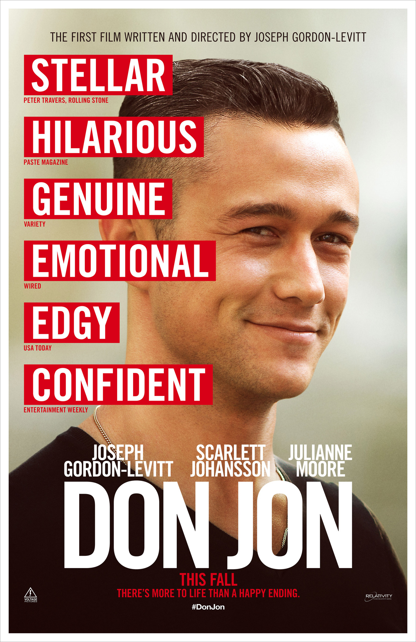
The poster for 'Don Jon' makes every attempt to promote the fact that Joseph Gordon Levitt is not only the film's main star, but also its writer and director, with the very top of the poster stating it is 'The First Film Written and Directed by Joseph Gordon Levitt'. Much of the poster is comprised solely of his face, with a friendly a confident smile that suits the comedy's laid back and light hearted feel. The design of the poster is very clean and classy with a neat white border around the edge of the poster and a limited use of colour except in the colour of his skin and the red boxes around the reviews. Obviously the designers thought it would be appropriate to use quotes from professional movie critics to help promote the movie, and so the words 'Stellar', 'Hilarious', 'Genuine', 'Emotional', 'Edgy', 'Confident' appear successively along the left side of the poster, each suggesting a different thing about the film, importantly that it is a comedy but also a drama, and that it is a strong debut from the director. Of course each of these words could have been taken massively out of context but nonetheless it works to add some sophistication and guarantee that it is a well-regarded film.
While only Gordon Levitt's face appears on the poster, credits for Scarlett Johansson and Julianne Moore, therefore part of the main cast, also appear above the film's title which is in large bold letters. Below the title is the film's tagline 'There's more to life than a happy ending' which is a humorous double entendre, referencing both the film's nature as a romantic comedy as well as the lead's obsession with porn which are otherwise non-apparent with the rest of the poster. The words 'This Fall' clearly suggest the poster has been designed for an American audience, while the hashtag beneath, much like what is seen with the poster for 'Filth', is a sign of the movie industry stepping away from official websites to a greater focus on cracking the social network market.
This trailer for 'True Grit', alongside those such as 'Clash of the Titans' and 'Tinker Tailor Soldier Spy', is a sum of various parts that is, in some respects, greater than the whole. It is very strong and evocative two minutes and thirty seconds that I feel, in a way, is let down by the final product (which to be fair is till a good film just not as great as the trailer promises). Anyway let's move on to the analysis. The trailer opens with a voice over and a series of shots that have, within seconds, established our lead's characters name and reputation, for being a badass one-eyed US Marshall with a large tally of men he has shot, and even killed. Following the studio logos, a steam train passes from right to left to reveal an establishing shot of a desert town, cementing the impression that this is set in the Old West, while the following dialogue introduces the character of Mattie Ross and her problem that only Cogburn can resolve. Her lines and the scenes that accompany them are an effective introduction to the plot and even the film's chief antagonist.
The trailer works so well due to the soundtrack choices, with the first half of the trailer accompanied by a dark, foreboding track with intense percussion and a Western feel that works brilliantly to set the stage for the second half that is scored by Johnny Cash's excellent rendition of 'God's Gonna Cut You Down', that is interrupted by a short series of scenes that introduce a major disruption to the equilibrium of the characters and Rooster Cogburn's oath to correct things, before throwing us straight in to a sequence of various clips from the film. The trailer climaxes with a brief epilogue in which an injured man pleads with Cogburn for mercy, before he replies "I can do nothing for you, son" and a gunshot marks the end of the trailer with the film's release date and the solitary word 'Retribution' acting as a tagline that guarantees that Cogburn will get his revenge. Overall, the trailer is successful in balancing a dark thriller vibe with a film set in the Old West, with a few moments of comedy scattered in. The emphasis on the accolades awarded to the film's cast and crew (with the distinct exception of relatively unknown, at least then, actress Hailee Steinfield - who would actually go on to recieve an Academy Award Nomination for her role in this film) is a successful attempt to present this as a film of the highest caliber, deserving of the audience's time and money.
The trailer for 'Only God Forgives' not only serves to please fans of director Nicolas Winding Refn and actor Ryan Gosling's previous collaboration 'Drive', but is a brilliant trailer on its own. We are thoroughly given a feel for the film's atmosphere and location through a number of elements that work together to astonish the audience. Like the trailer to 'Evil Dead' it begins with a red-band warning from the MPAA, already establishing that this film is likely to have adult elements such as extreme violence. The opening logos, as is the rest of the text throughout the trailer, are first (but only for a split second) presented in Thai (I believe) before translating into English. This is a reference to the location of the film, which is the city of Bangkok in Thailand, and the dual-language of the film which is English but also largely subtitled Thai. The text is shown in the style of red neon letters. Bangkok is famous for its nightlife, and neon signs are a part of that image of Bangkok that most people have in their minds.
Throughout the trailer the shots chosen have been composed meticulously, with characters shown often directly on or from the perspective of another character. There is a brilliant shot of Ryan Gosling's character and also of hands from his eyes, which involves the audiences in a way that makes them somewhat complicit in his actions, before he grips them in a kung-fu stance, suggesting that his character will be involved in a lot of action. Rule of thirds are kept in mind with the framing of these shots, and they are bathed in either very warm or very cold, saturated colours, such as red, purple or blue, again reflective of the Bangkok setting. The opening part of the trailer is sound tracked by a woman's narration, ostensibly Gosling's mother, whose word's "You were strange, you were different...they don't understand you, and I never will" establish the main character as a dangerous, unpredictable character, which will be major draw for fans of Gosling, who typically plays more relatable roles, as well as those unfamiliar with his work or who want to seem play a different type of role. This is cemented by a short, sudden, sequence in which his character violently attacks another before dragging him down a hallway by his jaw.
Then begins my favourite part of the trailer. Unusually for a violent thriller, the trailer makers have decided to use a sort of ballad-type song, sung in what I can only presume as Thai. The instrumentation of the song, coupled with the singer's calm and gentle voice, give of a kind of childlike or innocent notion that contrasts with the imagery shown, which includes guns being fired and people being killed. I believe this works really well as it helps to heighten the violence shown on screen - with most of the trailer strictly silent other than the music with the exception of dramatic sounds such a sword being drawn or birds fluttering past. The song increases in intensity when the Thai police chief character thrusts two chopsticks into the legs of another man - whose scream corresponds exactly with the music - and the trailer continues with a montage of various sequences from the film. The trailer climaxes with a long final note, as Gosling approaches the police chief and says his only line in the trailer, 'Wanna fight?', which signals the title screen. The calm manner in which he says it, as well as the choice to save any of his dialogue till the very end of the trailer, makes his character more mysterious, while the brief scene at the very end of him about to face off against the police chief gets the audience pumped to see him action without actually showing him deal any.
'Filth''s teaser poster instantly provides us with a good impression of what to expect when the film releases in cinemas later this year. The taglines at the very top of the image states 'It's a filthy job getting to the top, but somebody's got to do it'. The highly stylised image below is visual depiction of said statement, with James McAvoy's character shown climbing a set of stairs represented by a series of lines of cocaine. The line that is in closest proximity to the character's face is only half remaining - the obvious conclusion that can be made is that it has been snorted, suggesting he is a drug addict or at least a casual user of hard drugs. While his pose is supposedly as if he were climbing a ladder it also looks, in a way, as if he has collapsed on 'the way up to the top' and perhaps in the film has an overdose.
The overall design of the poster is very bold and simplistic. There is a strict colour scheme of blue and yellow which (as you should have learnt in Art class at primary school) are complimentary colours, which is conformed to even in the clothing of the character, whose is wearing a blue jacket and tobacco coloured chino trousers. The tagline, James McAvoy's credit and the film's title are all presented in a bold yellow sans-serif font, and the latter is preceded by a hashtag symbol. This is an indication that the designers of the poster are recognising that Twitter has a huge worldwide user-base and therefore is the best way to promote the film online. It is assumed that people that see the poster, then like what they see, might post a tweet with the #FILTH, therefore aiding promotion and generating a wider demographic of people who could potentially see the film.
"The Hobbit: The Desolation of Smaug" edition of EMPIRE Magazine is a very clean and classy looking affair. The designers have elected to use a bold, yet somewhat understated colour scheme of the eye-catching red that is the colour of both the magazine and the film's titles and desaturated grey that is envelops most of the image. The three characters that dominate the poster are Orlando Bloom's Legolas who is positioned centrally due to his recognisability with the general public compared to Lee Pace's Thranduil on the right and Evangeline Lily's character of Tauriel on the left who had been created for the purposes of the films and is not the creation of the book's original author J.R.R. Tolkien but rather that of Peter Jackson and his fellow writers. They are each shown armed with Elven weaponry, his trademark bow in the case of Legolas and are all stood sideways. Tauriel is shown standing in a more feminine position that enables her to look over her shoulder in a manner reminiscent of a glamour model's photo shoot to add to her sex appeal, while the men are in more powerful positions. They are all faced towards the reader in order for the latter to personally engage with these characters and be drawn to the cover.
The text around the edge and centre of the magazine is important in demonstrating the audience that EMPIRE is trying to attract. The top banner feature a series of unrelated titles (with exclamation marks for unnecessary emphasis) hinting towards stories that are are covered within the magazine's pages, while above the title of 'The Hobbit' sequel are the words 'On Set In Middle Earth!' to provide an indication as to the nature of the feature about the film, promising a close up behind the scenes look at the work of the cast and crew. With the cover clearly dedicated to the characters of these elves so is the chief tagline. 'Here Come The Elves' is followed by the quote "Less Wise...More Dangerous", a simple statement that has perhaps been shown in quote marks to suggest it had been spoken by someone involved with the film, not just the magazine, in order to add credibility to what is, otherwise, a rather annoying phrase. While the magazine to this point had a very organised feel to it, with a stylistic approach of diagonally angled words (and barcode) in a crisp, classy combination of serif and sans-serif fonts, the addition of a large box advertising a '32-Page Comedy Special!' is somewhat unbefitting, with the images of Will Ferrell, Simon Pegg and Steve Coogan providing a contrastingly unattractive series of counterparts to the three pretty-faced men and women above. However, obviously, at thirty two pages this feature is a large part of the magazine and so what seem a waste not to advertise this fact, and of course they have to cater to a wide audience and so focusing strictly on 'The Hobbit' and its fanbase would be detrimental to the success of the issue.
Opening with a MPAA-authorized 'Red Band' notice it is clear that the following trailer will be packed to the rim with over the top gore effects, if the title and its connection to the already established dark comedy splatter franchise hadn't already given that impression. The full length trailer to 2013's 'Evil Dead' opens with a short scene in which Jane Levy's character of Mia urges her brother to "...get me out of here" as a flurry of creepy sound effects, such as thunder, creaking doors and loud bams (between almost every shot) build to the trailer's first title card. Each word, 'From the producers of the horror classic', appear in quick succession accompanied by a series of heavy beats, setting a precedent for the remainder of the trailer which utilizes this technique to great effect throughout. The continuation of this statement, 'Comes a new vision', tells the audience that while this semi-reboot of the series is in familiar and capable hands there will a manner of innovation that brings the story to 21st century cinema. A rapid flash of incredibly graphic images, so quick they're pretty much indiscernible, sets the scene for the middle section of the trailer in which the plot is established through character dialogue but more clearly through the title cards that, while frequent and relatively large in number, do not feel excessive nor forced and only add to the dark atmosphere of the trailer. The tagline of sorts, 'Once you unleash evil...It will consume you', engages the audience by addressing them and treating them as if they are involved in the action of the film, as if they, themselves, are trapped in the cabin with the characters. The manner in which Mia's dialogue, in which she says "I think - it's in here - with us - now, is edited into fragmented sections with flashes of footage and sound in between, is an excellent way to build tension, with the very next shots heralding in the onslaught of bloody gore that will dominate the rest of the trailer.
Todorov's 'Theory of Narrative' can easily be applied to the structure of this trailer. The opening minute throws head first into a disrupted equilibrium, in which the Book of the Dead has been opened unleashing evil spirits upon the main characters, and only at the one minute mark have Mia's friends recognised this disruption as she goes on a full out frenzy on them, vomiting gallons of blood and one of the male characters confesses that he "...released something from that book...something evil". The attempt to repair this disruption occurs around the one minute thirty point when he resolves that they're "...going to have to kill her". The rest of the trailer, of course, does not depict the reinstatement of the equilibrium, per se, as they would just spoil the events of the ending, so instead the last forty five seconds are a non-stop barrage of clips that showcase the film's impressive practical effects from moments across he film, with Mia's evil voiced line "You are all going to die tonight" signalling the start of this sequence. What they have done interestingly with the soundtrack is that it pauses momentarily for key lines and more importantly screams and shots of limbs flying off bodies and characters driving chainsaws into other characters, showered in blood. This and the syncing of the screams to the music that gradually escalates is a powerful way to both terrify and stimulate the trailer audience.
The 'Evil Dead' trailer, in the manner of many trailers today, employs the technique of showing a short scene following the appearance of the film's title, which here is sound tracked by a series of short lyrics by Mia, in her zombie mode. The lyrics, "We're gonna get you...not another peep...time to go to sleep", while creepy enough are heightened by her playground-rhyme like way of singing, a common and familiar yet still powerful trope of many horror films. The final word "sleep" is edited slightly to give it a sudden ending, before the trailer cuts to the very final bit of footage in which Mia takes a blade to her tongue and slices it in twain before giving another female character a full on disgustingly bloody snog, with the sound of the latter's disgusted gagging in the audio, helping to repulse the audience. This last scene is a highly successful attempt to upstage all the other goriness that had come before, while also potentially drawing in the male crowd even more than it had before by depicting two girls locking lips, even as foul as the scene and Mia's face is. Following that, beneath the release date of the film are the words 'Become a Deadite' with the Facebook and Twitter logos adjacent - presumably some sort of way in which fans can be involved with the film's viral marketing campaign by sharing the trailer or something along those lines. Overall, I think this is generally a very well produced trailer for a film of any genre, though it is most admirable as being one of the horror genre due to its reluctance to simply drag out long scenes of the trailer for tension with a disappointing pay off and instead just going full out - which is what the audience wants, and fortunately, gets.
The teaser poster for 'The Wolverine' exceeds many others on a number of principles. Firstly, it stands out significantly from the rest by not being a photo-shopped rush job but an artistic design that demonstrates there has been a lot of thought and hard work put into the creation of it. It stands alone as a piece of art, in my eyes, and even adorned my bedroom wall for a period due to its sheer artistic beauty. The artist behind it has been inspired by Japanese culture and its art style, consistent with the setting of the film and therefore providing the audience with an idea with what they should expect. Secondly, it is very iconic. It does fall into the usual expectations of a poster by having the lead character in an overly stylized pose - in this case Wolverine's classic crossed claws (which have been successfully used in promotion of previous X-Men films) - however here this is used remarkably well. The classic pose represents the character's strength and prowess and will attract a wide variety of demographics. Interestingly, the size of his claws are slightly exaggerated, as in they are much longer than one would expect from prior films with the character, however this is probably to ensure they are recognisable.
Overall the image's simplicity and minimalism does it a number of favours by making it memorable. It presented in complete monochrome with only a splash of colour - the red of the release date's lettering and the Japanese symbol in the lower left of the poster - and Wolverine himself is engulfed in shadow. The details of his face are left much to the imagination of the viewer and this helps retain the sense of mystery that surrounds the character. The aforementioned Japanese symbol could perhaps be a clue of sorts to the film, but as someone who is not familiar with anything associated with the Japanese alphabet or the like, I do not understand its denotation, however it could just be something to further establish the Japanese style of the poster and setting of the film. At the bottom of the poster where one would expect cast and crew credits or at least a title, the designers have chosen to neglect either and simply present a date. This is sometimes seen on teaser posters as the studio want to maintain a sense of secrecy about the film instead of banking on the film's title, but with a character such as Wolverine who is instantly recognisable to most, whether they be young or old or even unaware of comic books, it is not important to show the film's title. In any case, the title is the name of the character so it could, perhaps, seem superfluous.
I have never been a huge fan of Total Film. Not for their features or articles, but for the simple fact their covers aren't as appealing as that of EMPIRE Magazine. They often are cluttered affairs, which resort to cheap tactics to draw readers and feature some shoddy design work, which are all demonstrated beautifully by the 'Man of Steel' cover from earlier this year. What first strikes me in this cover is the image and the title of the film, as they should do, but in this case neither make me want to the see the film any more than I had done before. In fact they lower my expectations somewhat due to their poor presentation on the cover of this magazine. Firstly they have chosen a mediocre photo - while Superman is stood in a pose that is expected of such a character, there is something off about the photo that does not seem worthy of a big film such as this one. Lois Lane, for instance is stood awkwardly in front of Superman while her pose, with her arms hanging like planks from her torso, is even more so. Both characters' faces, looking away, suggest that they are facing a potential threat or danger, or even just so they could look cool, while the titular Man of Steel's is stood determined with his fist clenched and cape swept back. Some may think they look heroic. I think they look annoying. But I guess that's just me, so I won't go into any more depth with this particular issue.
The font chosen for the film is just a mess. Cheesy, bold lettering with light flares along it and gradient effect that could be achieved by a Year 7 in an IT class with a couple of minutes to spare simply looks cheesy and is reminiscent of the rather tacky cover for the standard edition of Lady Gaga's 2011 album 'Born This Way'. Both above and below the title they have chosen even more annoying taglines to support it. The words 'It's time for a change', seemingly and attempt at 'oh, lol :)' humour (if you don't get it, it is a reference to the character's new actor as well as radically changed suit) which just annoys me, as does the 'New Suit, New Superman, New Superhero Franchise', a use of repetition and the rule of three - but which just seems like overkill to me.
The cover promises 'Complete & Exclusive Access' giving potential buyers a reason to choose this magazine over others (well other...there are really only two major film-based publications in the UK), while the publishers clearly saw the draw of 'Man of Steel' wasn't sufficient so promote this edition as 'The Heroes and Villains Issue' - with apparently one hundred of said characters featured inside the pages of the magazine, a selection of images of them displayed in their own special, little boxes at the top of the cover. In the bottom left is advertised 'An On-Set X-clusive' (clever!) - 'The Wolverine' which is followed by what I can only think of as the most moronic tagline ever in the history of film publications, 'Fight, Fight, Fight!'...I guess it gets the point across. On the opposite side of the cover is littered a number of other little hints at what's inside, for instance 'Ryan Gosling: Bad Boy', 'Bradley Cooper: Good Guy'...we're getting there, so far so good...here we go, 'Kevin Bacon: Grilled'.
I'll admit I smiled. In excruciating embarrassment for the human race.
NOTE: I am not usually this nit-picky. Except it is very late, I am very tired, and I wanted something I could rip into like a rabid dog with a chew toy. I apologise.
The initial trailer for the critic and audience polarising "Cloud Atlas" by directors Lana & Andy Wachowski and Tom Tykwer- one of my favourite releases this year - was unusual in that it was over six minutes long (twice the length of a typical theatrical trailer). This was deemed necessary due to the complex nature of the film - with six concurrent story-lines that take place in different eras it meant the trailer would have to be long enough to sufficiently explore and showcase each of them.
"Cloud Atlas" is fundamentally a science fiction film - dealing with the concept of rebirth throughout the centuries - with the scenes of a neon futuristic cityscape a la "Blade Runner" that include laser guns and spacecraft looking vehicles conforming to the audience's expectations of the genre. Other codes that are typical of the sci-fi genre that are present in this trailer include a wide variety of special and visual effects such as explosions as well as powerful, and somewhat symbolic imagery - that is highly present throughout the length of the trailer, a major example being how the title shot of clouds (fitting with the title that is on screen) transitions into a dark starry night - before fading into black and then presenting an underwater scene as the cast names appear.
With a film such as this, mise-en-scene is especially important. Spanning six different eras, the film obviously includes a wide range of props, costumes, makeup, locations and themes. In the trailer for "Cloud Atlas", the use of makeup is highlighted to showcase the variety of characters that are played by each of the cast members, for instance throughout the trailer Tom Hanks is depicted in a number of guises that are each instantly distinguishable as different characters. While a number of the scenes depict characters in period and also modern day clothing, the sci-fi inspired outfits worn by the futuristic characters help to support the genre heavily, and appeal to audience members who are familiar with such iconic looking visuals popularised by science fiction cinema in the past few decades. Despite the appearance of many major actors and actresses, no special attention is brought to their names until the very end of the trailer unlike many trailers that seem to pander to the audience's recognition of a name. Perhaps, despite the makeup and costumes, the makers of the trailer assume the audience will instantly recognize the faces of the actors without having to be reminded of their names or their achievements - such as placing accolades such as 'Academy Award Winner' Tom Hanks which can sometimes be detrimental as it could look like a cheap attempt for the film to look more highbrow.
"Cloud Atlas" is incredibly postmodern in the way it handles genre. The trailer is evidence of this as it attempts to portray the film as not only of the science-fiction genre, but also romance, drama, thriller and even comedy at times. This so called 'mashup' of genres would not be familiar to a mainstream cinema audience so could be a turn off to some moviegoers who would prefer a film that stays true to its genre (and therefore more accessible) however I believe the trailer handles the balance of genres and especially the emotions associated with watching them amazingly well.
While the editing of the trailer was no small achievement, cutting between countless story-lines seamlessly, it is the music that was really powerful in influencing my emotions, and fundamentally my anticipation in viewing the film. It is most effective when it seems to work alongside the footage perfectly, especially between 2:29 and 3:14 when the music both supports and is supported by the voice overs of various characters such as those of actors Tom Hanks and Susan Sarandon. This is another convention of trailers, particularly epics and sci-fi films, when they use powerful lines of dialogue from the film to drive the trailer forward, rather than a 'voice over man' style affair that would be found in older trailers. The soundtrack here, however, ranges from what could be considered typical trailer music to what is not usually found in sci-fi trailers, for instance the song "Outro" by French electronic band M83, that accompanies the montage of scenes in the final part of the trailer, helping to support the overwhelming epic feeling of the trailer as a whole. It is during the sequence that title cards are introduced to help establish further the all-encompassing themes of the film: 'Death', 'Life', 'Birth' and 'Future', 'Present', 'Past' all appear in successive order - the reverse nature of their appearances suggestive of the impact of past events and actions on what is happening and what will happen, 'Everything is Connected' (which happens to be the tagline for the film, but does not appear in the trailer).
Overall, I believe that while the trailer to "Cloud Atlas", in my opinion, was breathtaking, it perhaps wasn't the most effective in explaining its nature, and specifically its genre, to the wider mass audiences who would not be familiar with or keen on the work it is based on or other similar films that explore comparable concepts and are present in a similar time-spanning, genre-bending manner, such as Darren Aronofsky's "The Fountain". However, in the end this particular trailer is a great example of one that both conforms to and subverts the conventions of its genre, and while it does not provide a clear idea of its narrative, I believe this only makes the film more intriguing, especially with the editing done in such a way as to not spoil the events of the film significantly.
The early marketing and promotion for Ridley Scott's prequel to his seminal sci-fi flick 'Alien' was shrouded in mystery and secrecy. This is reflected in the teaser trailer for 'Prometheus' that, at a brief one minute and ten seconds, offers an insight into the film without providing a great deal of context and therefore preserving the majority of the storyline until later trailers or even the film's release. This is a major strength of this trailer which, in my opinion, is one of the finest of recent years. The trailer is instigated by a heavily edited version of the 20th Century Fox logo - it is desaturated and given a very aliased appearance to suggest the look of a broken monitor. This altering of pre-existing materials to suit the world of the film is something I would like to experiment with when creating my trailer, making something as commonplace as a studio logo unique.
The opening narration, provided by the voice of a panicked and apologetic woman (Noomi Rapace as her character of Elizabeth Shaw) establishes the dark and nature of the film. Her line "You don't understand...I was wrong...we were so wrong" as heard over the opening logos immediately creates a huge enigma regarding the context of her statement and what she is referring to, as well as of course who she is talking to. The soundtrack - which is at this point an haunting soundscape - suddenly stops and the visuals instantly cut to a title card, 'From Director Ridley Scott'. To introduce and acknowledge the director's name this early in the trailer is a testament to the director's selling power. Clearly his fame within the genre, and of course the franchise, is a major unique selling point that will bring in the audiences the studio wants. There is no mention of any one of his previous works as the studio understand his name alone will be recognition enough. The typography in this trailer is a very standard sans-serif font, thereby looking very clean and fitting in with the futuristic aesthetics while also contrasting with the landscape of the alien planet.
The first proper shot of the trailer is, understandably, that of the titular spacecraft approaching a planet. This confirms the audience's suspicion that this is in fact a film of the science fiction genre, and the successive shots used only help to reinforce that, including futuristic technologies such as the red lasers as well as the mysterious corridors that are reminiscent of the production design for 'Alien'. As a teaser trailer, it is important to give the audiences a good idea of what the film entails and so the makers of the trailer include footage from various points in the film that are cut together rapidly, but what they have done here that is interesting is incorporate the title of the film into the entire proceedings. Over the course of most of the trailer, the title 'Prometheus' gradually appears, starting as only thin straight vertical lines that slowly build and build until the word is completely formed overlaying the footage of the film. This is a clear reference to the teaser trailer for 'Alien' that used the same technique, and so we can see they are further catering to people familiar with the older film but more importantly are constantly reminding audiences of the film they should be seeing. I think this is an amazingly well-executed concept as it looks great visually and adds to the various enigmas as audiences may wonder what is being constructed over time on screen.
Music is very important in this trailer. The editors responsible has obviously fallen into the recent trend of dramatic loud horns that punctuate every shot, as the trailer for 'Inception' did so brilliantly, with the soundtrack being a major driving force, synchronised with shots to great effect - however as they had done with the title of the film are making reference to the earlier film's trailer by reusing the same strange alien-esque sound effect. Here they, at certain points in the trailer, combine it with on-screen character's screams to bring greater cohesiveness to the whole. Over two thirds into the trailer, with the title completely formed and the action cut to black, you would expect the trailer to end, however it suddenly continues, with the upside down face of Shaw, giving a pleaful shriek. The final part of this trailer is then dedicated to showcasing what the studio expect is a standout sequence - two female characters in spacesuits running from the falling alien spacecraft - while also providing a tagline of sorts, between shots, that should help reiterate what the film is about without giving too much away. 'They went looking...for our beginning...what they found...could be our end' is a very simplistic but evocative description of the film which should be enough to sway audiences into seeing it.
As an example of social media trends becoming more important in the marketing of films, the trailer finishes not only with the release date but a link to the film's Facebook page, rather than the actual website of the film. I thought it only a requirement for me to research whether the film actually had a website, and currently it does - however in the form of a viral marketing site that is written as if it exists within the film's fictional universe. Perhaps at the time of the teaser's release this website had not been completed, but if it had maybe the studio thought it would be more attractive to prospective casual audiences to provide them with a more appealing and user-friendly source, in this case a social networking site, to discover more about the film. What is also interesting is the lack of promotion of the film's availability in 3D, with the Real-D 3D logo and others only appearing in comparatively tiny lettering at the bottom of the film's cast and crew credits. Despite Ridley Scott being a vocal supporter by choosing to shoot the film in native 3D, the studio do not seem to deem it worthy enough to showcase this fact or capitalise on it. There are two obvious explanations - the majority of big releases these days can be found in both 2D and 3D formats and so there is no point pointing this out to an audience who wouldn't expect any different or the studio are aware of the declining appeal and popularity of the format and don't want to risk turning away moviegoers who have grown wary of 3D. Anyway, back to the point of this analysis which is what I have learnt that I could use to success when creating my own trailer, and that is that less is sometimes better - keeping the exact nature of the story to a minimum to ensure the audience is intrigued but not overwhelmed with information - and that the title can be a powerful tool...these are both things I will take into account when preparing my piece.
This poster for "Man of Steel" instantly conveys its genre as being that of a superhero film, by depicting and focusing solely on the title character in flight, while dressed in his iconic red and blue costume with right fist clenched. The designers have chosen to show the film's lead actor, Henry Cavill, in a relatively close up angle, however there is no emphasis on his name, suggesting that his appearance in the film is not a unique selling point for audiences, due to his relative obscurity. Even director Zack Snyder's name only appears in small lettering above the cast list, and Christopher Nolan's role (albeit small) as producer of the film is not used to promote the film in this poster, showing the movie studio is relying on emphasising the recognisability of the character, rather than the talent behind the film, to promote it.
With the exception of Superman's striking blue and red outfit (with the red again the colour of the emblem behind the film's logo), the poster is devoid of much colour, and takes on a rather monochrome, with tints of blue, appearance. This style, a somewhat recent convention of movie posters, is often used to suggest a dark or cold feeling, fitting with the more 'realistic' approach of this reboot of the franchise as well as the title's use of the word 'steel'. Despite the obvious components that are present in film posters, such as the logo (in bold silver lettering), cast and crew credits, release dates and studio logos, the poster is unconventional when compared to posters of other big releases, as it chooses to focus on only one of the film's characters and depicts them in motion (with motion blur and bright blue lens flare applied) resulting in the image looking somewhat blurred. In my opinion, I am not a fan of this approach as I find it makes the poster look aesthetically unappealing, however I recognise the designer's intention was to show Superman flying at a great speed. Overall, however, the poster should appeal to its target audience successfully as both the image of Henry Cavill as the titular Man of Steel and the movie's logo (accompanied by the instantly recognisable Superman emblem) should provide enough brand recognition and excitement to attract audiences.
This is another one of the film's posters, which again depicts the Man of Steel using his most famous power of flight. This time however there is huge emphasis on the Superman emblem rather than the character or the actor himself, who is shown as very small in the overall poster. The emblem even appears twice, first taking up most space of the poster, but also appearing at the bottom, in small, behind the letters of the film's logo, somewhat redundant. Again, the designers have chosen not to use the lead actors or the director as the major selling point, appearing only at the bottom among the rest of the cast and crew, but rely on Superman's fame in popular culture to sell tickets.