

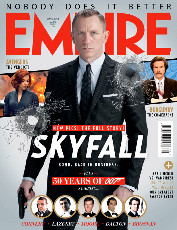
With a character as big as Bond, care must be made to respect the class and sophistication of the fictional MI6 agent while also highlighting the sheer badassery of the man. Typically, as I have seen through previous analyses, unlike Total Film who have released some horrendous covers with some of the worst photoshopping I've come across and even worse placement of images and mindnumbingly dumb taglines that are clearly intended to draw in the reader's attention but only serve to repel me from ever delving into their pages, EMPIRE Magazine have been consistent (I am not factoring in that disgusting ugly 'The Amazing Spider-Man 2' cover) in giving us something that is clean and eye-catching and with fonts small enough not to detract from the presentation. The 'Skyfall' edition of the magazine makes sure to emphasise the amount of content relating to Bond that is present within its pages. This is done by giving us a nice big image of Daniel Craig in character, wielding a Walther PPK, as he frequently does, with a neutral but reassuring while simultaneously giving a 'staring in the face of danger look' that would melt the heart of any foreign, effeminate, maniacal world-dominating type and send them back to the mothers for comfort and support. Suited up in the finest money can buy, Bond is clearly the sort of guy you'd want on your cover - lean, men and a well-dressed machine. His head covers the middle section of the magazine's title but I'm sure this was something the publisher would be willing to sacrifice to ensure Bond would have as much page space as possible, and I am thankful for that.
The title of the film appears just below the centre of the cover and a small tagline below, 'Bond. Back in Business' is short, sweet and to the point. It had been several years since the release of the previous Bond film and so I expect EMPIRE would understand the anticipation of the masses who can finally have their hero back. Immediately underneath is the text 'Plus 50 Years of 007 (with the character's codename in its familiar logo) starring' which is then followed by pictures of the five previous Bonds, actor's surname in tow. The very top of the magazine cover has the words 'Nobody Does It Better'. This is a reference to the hugely successful, and a fan-favourite at that, Bond song from the film 'The Spy Who Loved Me', again one of the most famous and recognisable of the franchise. This phrase is a comment from EMPIRE Magazine that will surely resonate among Bond fans who would accept no replacement when it comes to badass British, semi-misogynistic, secret agents. Overall, the typography of the cover is excellent. Simplicity is key and EMPIRE have decided to play it safe by using bold fonts and colours, with red and white the major players, but with gold to add a further element of class to their magazine. Two bullet holes punctuate either side of the cover, and while their inclusion may seem a desperate attempt to make their otherwise calm poster more exciting, they are aesthetically pleasing and add a somewhat three dimensional effect to the cover.
Sadly, though, the beauty of the cover and its devotion to Bond is compromised by the placement of the characters of Black Widow and Ron Burgundy from the 'Avengers' and 'Anchorman' franchises, respectively. Their images seems majorly out of place in regards to the rest of the cover, especially the latter character and his immediate comedy connotations (plus his film's release is a year and half after from the publication of this issue so surely there would be a more time-appropriate film to advertise). However despite this, as well as the annoying taglines for other features at the side of the magazine, I have decided to forgive EMPIRE as the rest of the cover is so well done. Again, I recognise that simplicity is king, and I will have to make sure my magazine is classy and uncrowded to guarantee it has the look and authenticity of a top tier publication.